
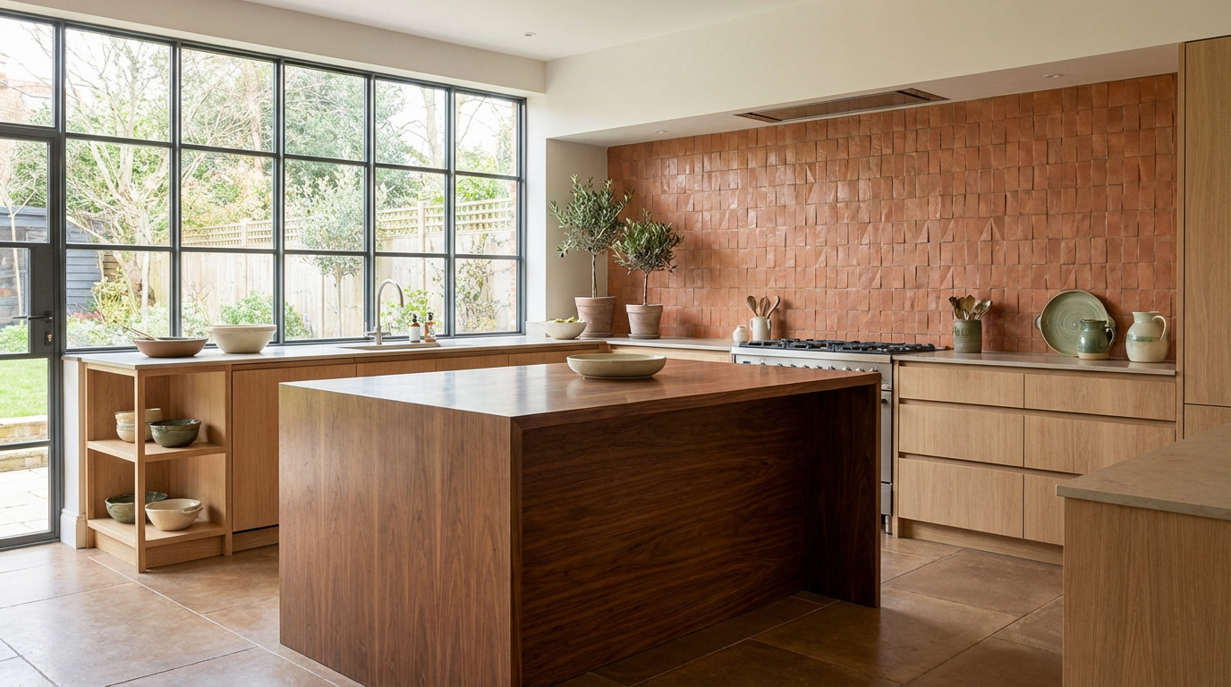
Many interior design enthusiasts hesitate to design a terracotta wood kitchen for fear of saturating the space or creating a visual effect that is too heavy and outdated.
This guide analyzes the complementarity between the minerality of clay and the warmth of natural woods such as light oak or walnut in order to establish a resolutely modern Mediterranean atmosphere.
Through the study of the handcrafted textures of zellige and the secrets of appropriate lighting, readers will discover how to balance these natural materials to transform their room into a welcoming, sophisticated and timeless living space.
The alchemy between terracotta and wood in the kitchen
Having set the scene for this warm trend, let's explore why this duo works so well on our emotions and senses.
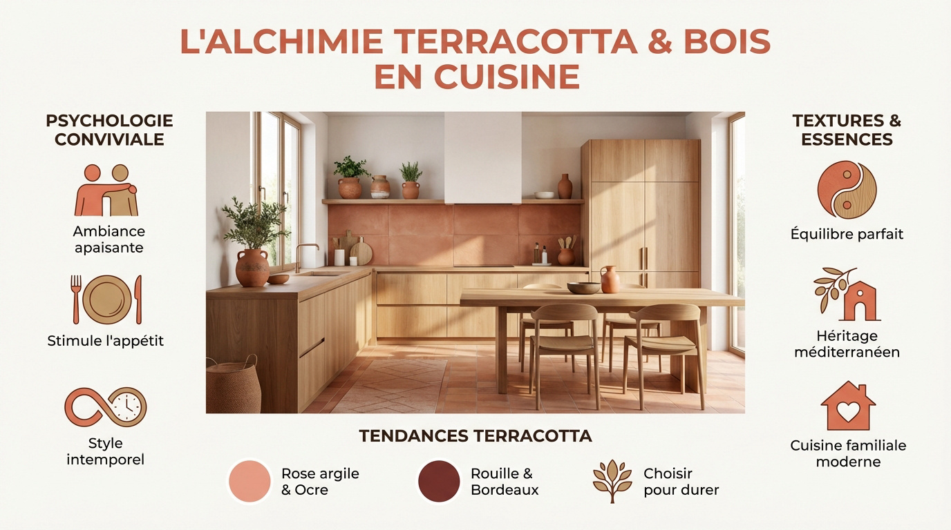
A psychology of colors geared towards conviviality
Earthy tones create a soothing social environment. These shades naturally encourage conversation during meal preparation. Here, the pleasure of cooking together in a serene atmosphere.
Terracotta stimulates the appetite while providing immediate comfort. This organic palette offers a sense of well-being that is essential every day. You feel enveloped in genuine warmth.
This style transcends a mere passing trend. It is now a future timeless classic.
The natural complementarity of textures and essences
The union of the earth's mineral quality and the warmth of the wood creates a perfect balance. The contrast between the matte finish and the wood grain provides unique visual depth. This combination enhances every detail of the design.
The wood provides the structure while the terracotta infuses the soul and warmth needed for any modern family kitchen.
This association is reminiscent of Mediterranean artisan houses. It reconnects us to our southern architectural roots with elegant simplicity.
| Benefits | Disadvantages |
|---|---|
| Organic and warm atmosphere | Requires precise lighting |
| Durable and timeless materials | Regular wood maintenance |
Terracotta shades for the coming years
pink and ochre are emerging as the new stars. These soft shades allow for easy integration into all contemporary interiors without ever visually overwhelming the space.
Rust and burgundy pigments add character. These dark colors bring a luxurious and enveloping dimension to the room. They create a sophisticated and textured decor
It's best to choose a shade that lasts. A color that stands the test of time without becoming tiresome is ideal for your long-term decorating needs.
3 golden rules for balancing colors and materials
Understanding aesthetics is a good start, but the technical application requires respecting a precise dosage to avoid errors in taste.
Adjust the ratio of wood to color according to the size of the room
The combination of terracotta and wood in a kitchen is a rapidly evolving trend. A visual theme prevents the colors from overwhelming the space. A light color scheme allows the room to breathe.
Terracotta tiles should be adapted to the actual dimensions of a kitchen. In a small space, painting just one accent wall is more than enough to transform the atmosphere without overwhelming it.
- Ratio 60/30/10
- Light wood wall cabinets
- Terracotta on the back wall
Choosing the ideal wood species for each wall with terracotta
Birch and pine are the dominant woods, used to maximize ambient light. These species temper the natural intensity of the terracotta. This is the ideal choice for achieving a fresh, Scandinavian look that clearly enhances the décor
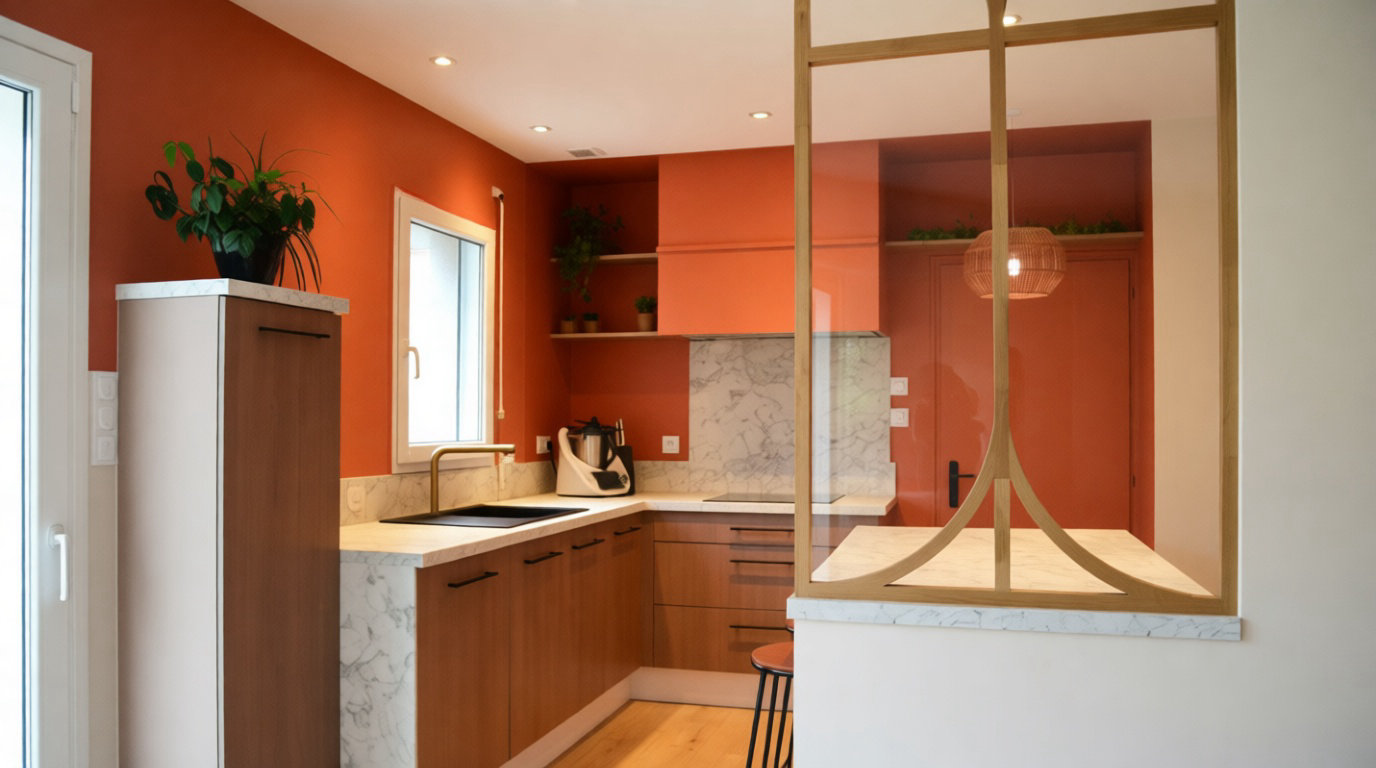
Oak lends a rustic and solid character as it blends wonderfully with bricks or ochre tones.
The walnut creates a high-end contrast and its depth enhances the clay-pink hues.
The importance of lighting in revealing mineral pigments
Opt for warm lighting to bring out the vibrant orange pigments. Cool bulbs dull the terracotta. Soft color create a cozy atmosphere.
Use multiple light sources to modulate the space. Strip lights under furniture and central pendant lights transform the atmosphere depending on the time of day.
Natural light alters perception. Observe the color change from morning to evening.
Creating a modern or industrial-style terracotta kitchen
If the basic rules are understood, let's see how, in a contemporary design context, to transpose this duo between the 2 materials.
Clean lines and smooth facades in light wood
Opting for handle-free facades is a rapidly growing trend. Minimalism emphasizes the organic texture of birch, resulting in a visually fluid and calming surface.
In fact, pairing a terracotta backsplash with a white countertop is a smart move. The quartz provides a brightness that modernizes the earthy tones. The result instantly feels fresher.
Maintaining spatial clarity remains fundamental. Avoid clutter to allow light to circulate .
The graphic contrast with black and raw metal
Yet, the black metal structures the volume with a natural authority. It infuses the rigor characteristic of the workshop style. This contrast highlights the softness of the terracotta. It's a marriage of character, bold and balanced.
Using dark light fixtures or slim handles makes all the difference. These black details serve as effective visual punctuation in the decor.
Black metal perfectly complements the duo. Here are the recommended materials for this design style.
| Element | Recommended material | Desired effect |
|---|---|---|
| Island structure | Black steel | Industrial rigor |
| Handles | Cast Iron | Handcrafted touch |
| Lighting fixtures | Matte aluminum | Graphic Modernity |
| Canopy | Raw metal | Light transition |
Incorporate color through small touches and accessories
But adding terracotta to linens remains an effective trick. Dish towels or other textiles are perfectly adequate. The handcrafted tableware on display also reinforces this color scheme.
Installing raw oak shelves is what motivates most decorators. They hold ceramic pots or vintage finds. The result is a distinctive and lived-in decor
Varying the finishes adds depth. Is this a trend that is likely to strengthen in the future?
Create an organic and bohemian atmosphere using raw materials
For those who prefer softness and authenticity, the bohemian style offers a suitable canvas for expressing natural materials. Is this a trend destined to grow stronger in the future?
Opt for solid wood and matte paint finishes
Choose thick, high-quality oak worktops . Exposed beams enhance the rustic feel. Solid wood is a living material that develops a patina over time.
Apply matte, powdery paints. They absorb light instead of reflecting it. The result is more authentic and closer to the earth.
Maintain the wood regularly. Annual oiling preserves its beauty and protection.
The zellige backsplash offers a vibrant, handcrafted texture
Zellige tiles bring charming irregularities. Each tile is unique in shape and shade. This creates a visual movement that industrial tiles will never have. It's vibrant.
Play with the shine of the enamel. These reflections compensate for the matte finish of the wooden furniture for a perfect balance.
The imperfection of the zellige is what gives all its character to a kitchen where the hand of man can be discerned.
Plant decoration and natural fibers as complementary elements
Add some green herbs. Sage and basil enhance the warm tones. It's an organic combination that always works.
Incorporate rattan and jute. Woven pendant lights or a natural rug on the floor complete the look. These fibers provide an almost essential extra texture
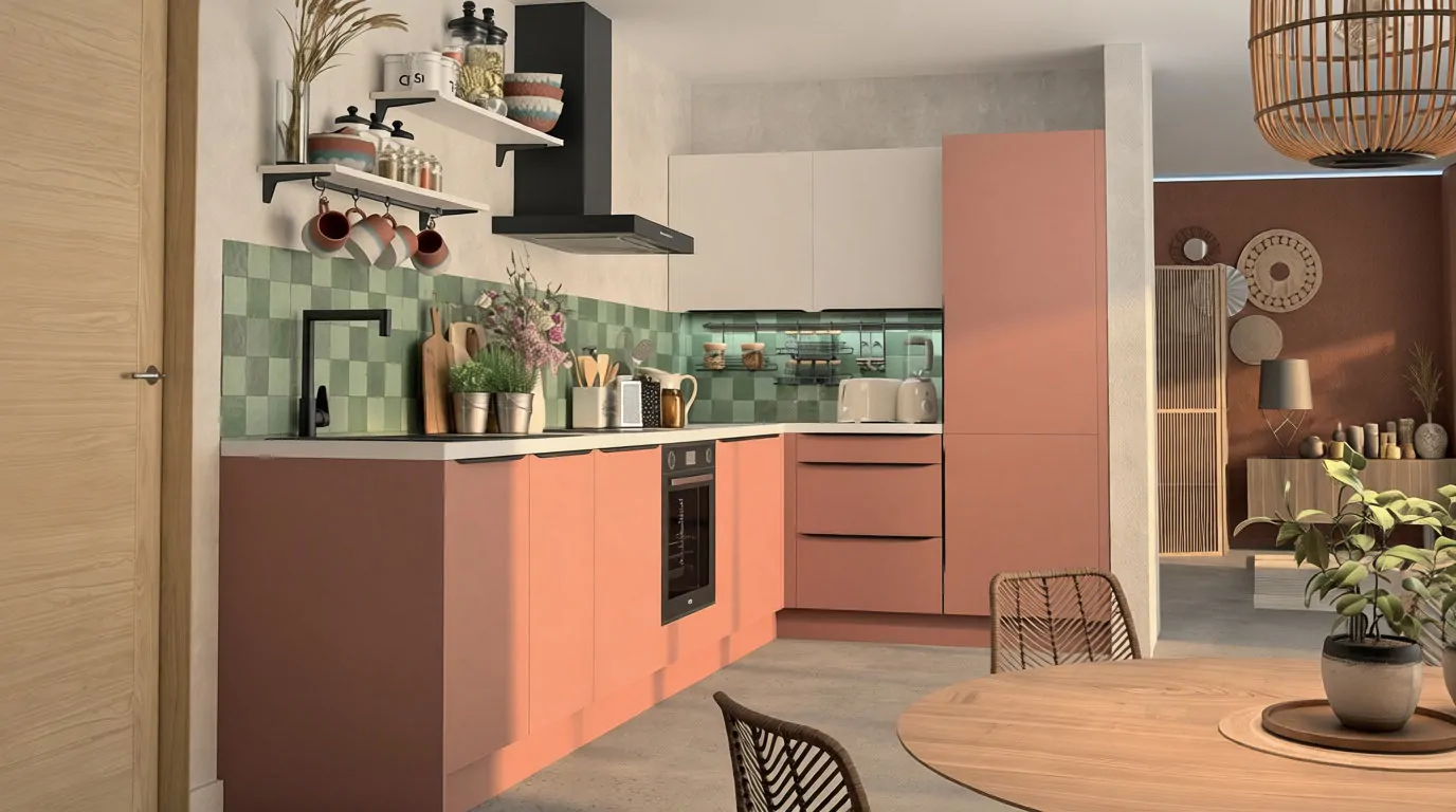
Carefully manage the transition from living room to living room. Use color accents to harmonize the open space.
The elegance of a sophisticated kitchen with high-end finishes
Finally, in a context of seeking prestige, terracotta can also become luxurious when it meets noble materials and precious metallic finishes.
The marriage of deep walnut with saturated terracotta tones
Walnut offers unparalleled visual depth. Paired with brick terracotta, it creates a cozy atmosphere. This is the epitome of contemporary chic.
The central island should be treated as a true sculpture. The blending of textures occurs on different levels. This contrast of dark tones reinforces the architectural aspect.
Dare to use saturated colors. They envelop the space in a luxury that is both discreet and warm.
Select worktops in natural stone or granite
A stone with pronounced veining adds dynamism to the entire kitchen. It guarantees superior resistance to heavy use compared to wood. Dark granite stands out as an excellent choice. It's a long-term solution.
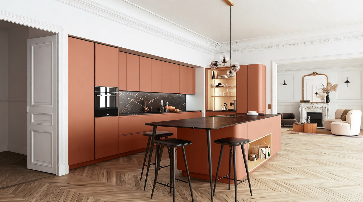
The idea is to better harmonize the pigments of the rock with those of the earth in an interior. We will look for echoes of iron or quartz in the rock.
- Black granite for contrast
- Beige quartzite for softness
- Veined marble for prestige
Enhance the space with brass or bronze finishes
Brass casts a magnificent golden sheen. This material instantly enhances the matte finish of wood and earth. It's the precise detail that transforms the atmosphere.
Coordinating the faucets and handles will be beneficial. Bronze offers a more discreet yet equally elegant alternative. Matte black appliances perfectly complement these metallic touches.
These accents should be used sparingly. Luxury often lies in the subtlety of the details.
The combination of wood and terracotta hues creates a warm kitchen, blending Mediterranean authenticity and organic elegance.
Harmonize your mineral textures today with oak or walnut essences to enhance your everyday life and enjoy a restorative decor.
Your future interior is just waiting for this warmth to radiate lastingly!
Practical questions
Why is the combination of terracotta and wood considered ideal for a kitchen?
This combination is proving highly successful because it evokes Mediterranean atmospheres and responds to a trend towards a return to natural materials. While terracotta brings immediate warmth and an organic dimension, wood infuses a vibrant softness that transforms the room into a welcoming and soothing space.
What type of wood is best to complement terracotta shades?
The choice depends on the desired effect. Light woods, such as birch or pine, are perfect for adding brightness and toning down the intensity of orange pigments. Conversely, walnut or dark oak create a sophisticated and high-end contrast, ideal for highlighting more saturated terracotta or burgundy hues.
How to use terracotta colour without saturating the kitchen space?
It's advisable to adopt a balanced approach, for example by applying the color to a single accent wall or the backsplash. In smaller spaces, using softer shades like clay pink or apricot helps maintain a sense of spaciousness while still enjoying the enveloping quality of this mineral palette.
What type of lighting best reveals the pigments of terracotta and wood?
Using warm lighting is essential to bring out the vibrant hues of terracotta, as cool bulbs tend to dull these pigments. It's recommended to use multiple light sources, such as LED strips under wall cabinets and pendant lights made of natural materials, to adjust the ambiance according to the daylight.
What complementary colors should be chosen to harmonize this natural ensemble?
Neutral tones like off-white, sandy beige, or gray create a calming visual balance. For a bolder, more modern look, adding touches of matte black or olive green provides extra depth and highlights the handcrafted character of raw materials like wood and ceramic.
Why choose a zellige backsplash in a wood and terracotta kitchen?
Zellige tiles are particularly prized for their charming irregularities and subtle variations in color, which create a unique visual movement. Their glossy finish provides an interesting contrast to the matte wood fronts, reinforcing the authentic, bohemian feel of a kitchen where the human touch remains evident.
How to integrate the industrial style with a wood and terracotta duo?
For an urban look, combine clean lines in light wood facades with black metal elements, such as a glass roof or industrial-style lighting. This graphic contrast between the starkness of the metal and the softness of the terracotta instantly modernizes the atmosphere.
